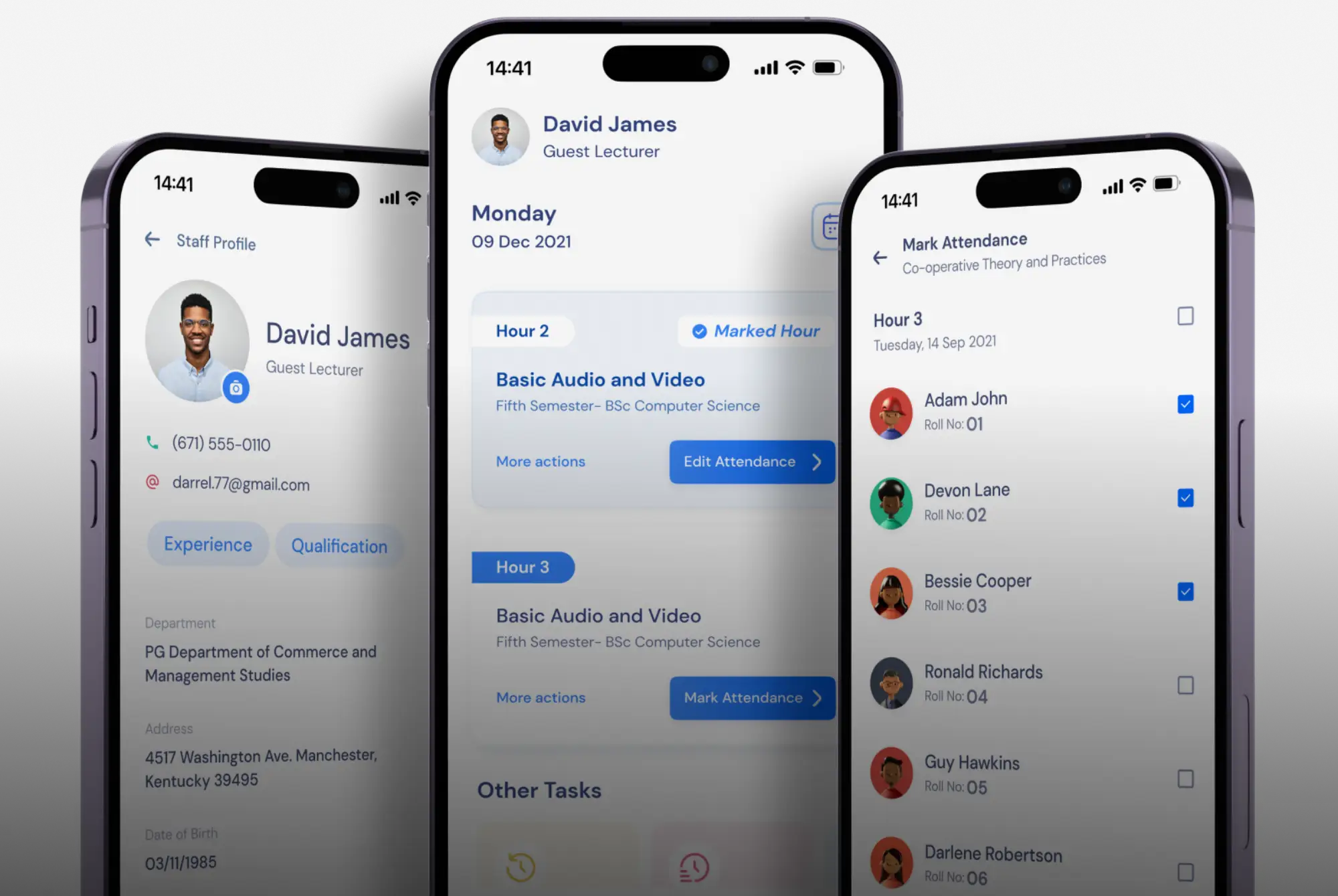
Redesigning Experience
of
Campus Solution
First UX Project • Aug 2021 - Jan 2022
Introduction

Total Campus Solution, one of Meshilogic's premier products, empowers higher education institutions by consolidating their operations into an integrated web and mobile application. This versatile tool efficiently manages tasks like attendance tracking, examination reports, and leave requests.

The software features three gateways, providing students, parents, managers, staff, and administration with individualized access to input data and view reports within their respective domains.

My role

Being the sole designer, I managed the entire project, covering both the experience and interface design aspects.

I started off with basic research to pinpoint shortcomings in the old version of the mobile app and identify user pain points. Subsequently, I crafted wireframes, low-fidelity designs, and finalized the designs.
Duration
6 Months
My Role
Product Designer
Deliverables
Sketches, Wireframes, Creative direction and Product management
Client
Research
‍I delved into our archive of client reviews and conducted face-to-face user interviews to pinpoint the primary challenges our users were encountering.

This process provided valuable insights into the issues users faced and enabled me to identify opportunities for improving usability.
Why redesign?
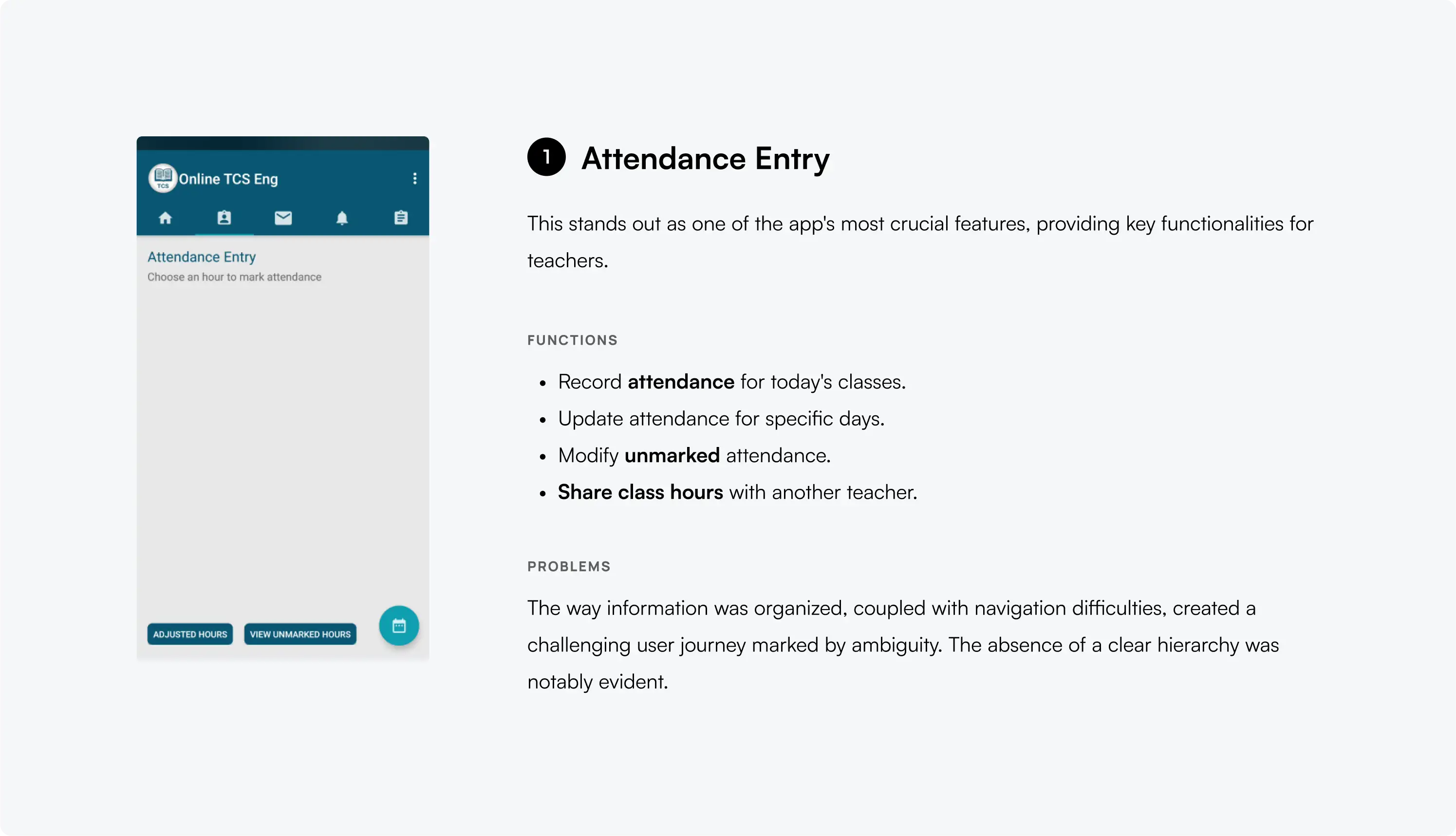
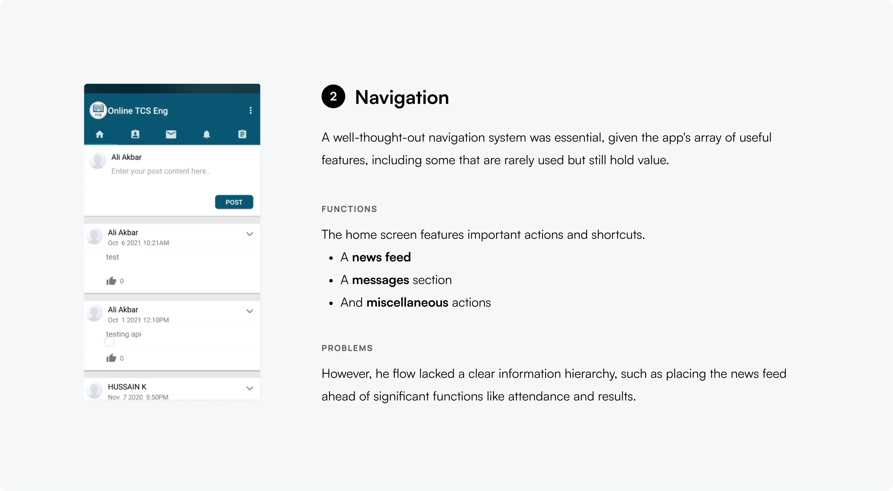
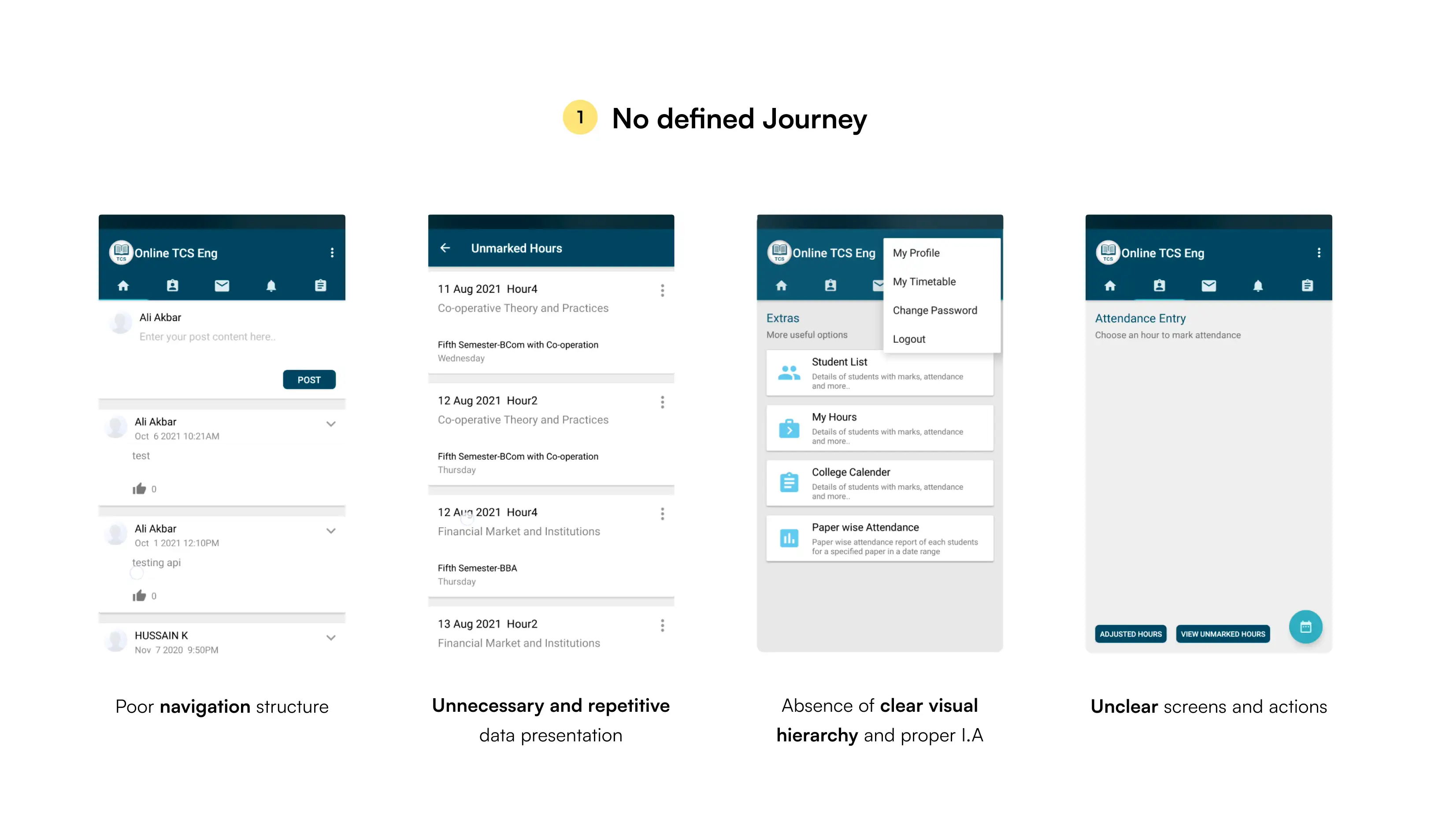
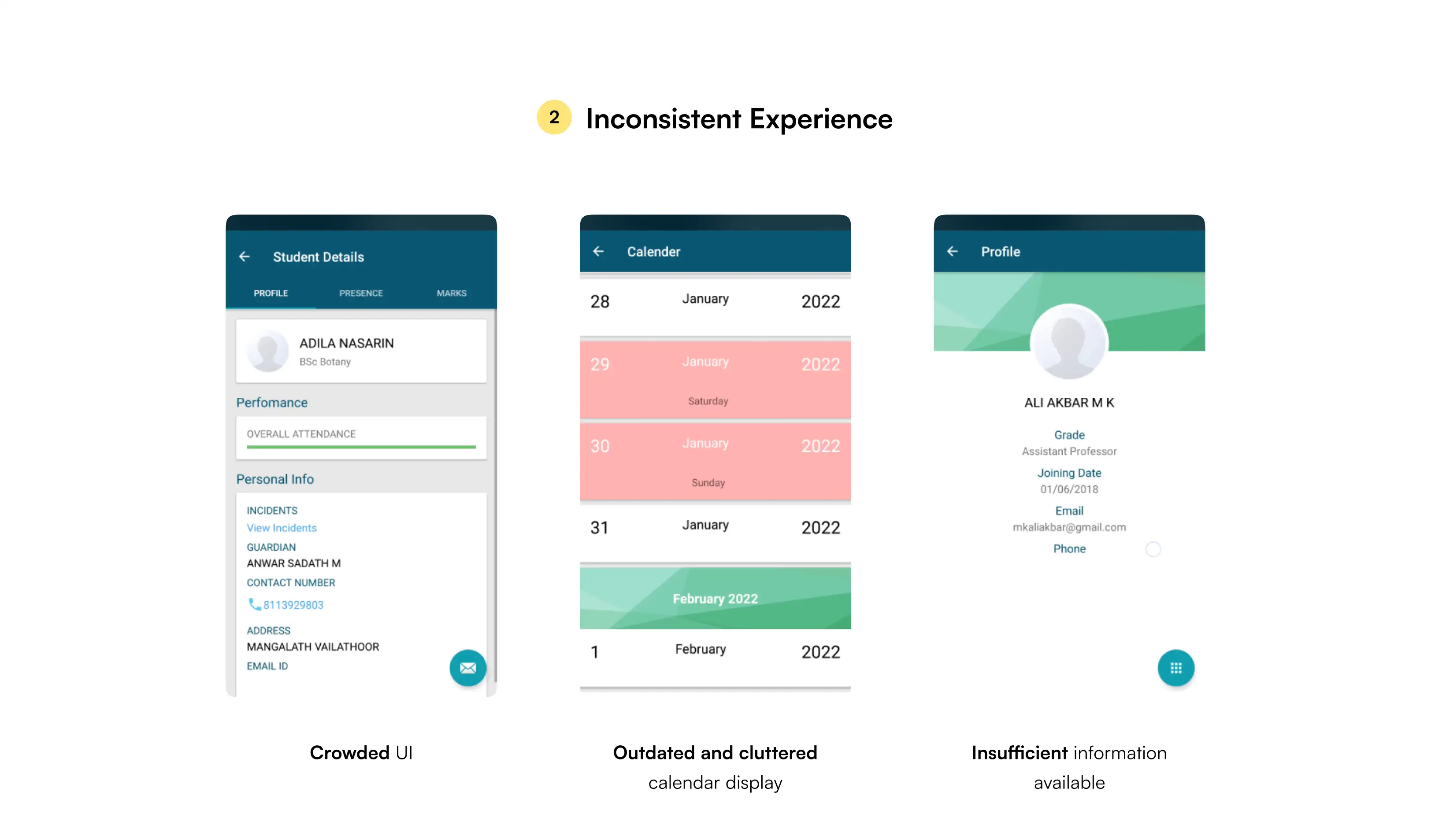
The TCS Mobile app has maintained a consistent experience since 2016. Upon analyzing the research findings, the key issues with the overall user experience are identified as follows.
The app's main goal was to streamline crucial tasks for users, especially teachers, such as recording attendance and accessing exam results.

However, the unclear journey of the mobile app made it challenging for users to comprehend its purpose. Therefore, a redesign became essential.
Major pain-points
Goals from redesign
Prioritize essential features.
Through research, determine critical features to prioritize and trim down the product by eliminating unnecessary ones.
Get things done with ease.
Users should seamlessly accomplish all tasks without facing difficulties or lengthy procedures while using the app.
Simplified and intuitive Ui.
By reducing visual noise and complexity, minimizing user frustration and confusion, fostering a positive user experience.
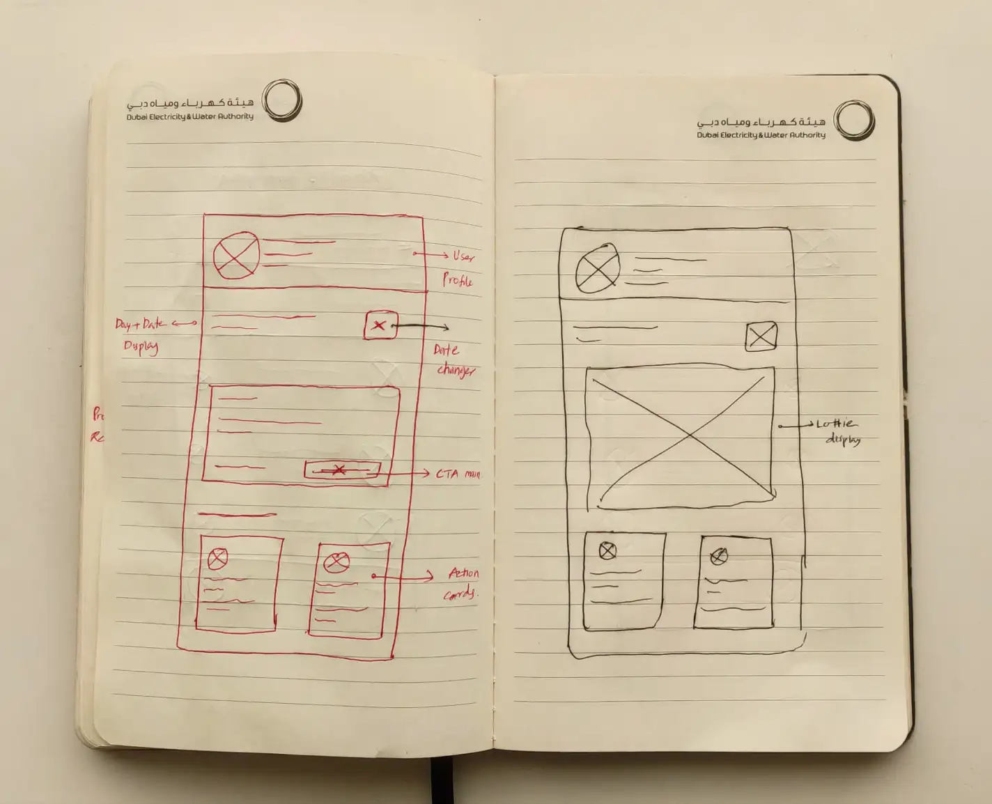
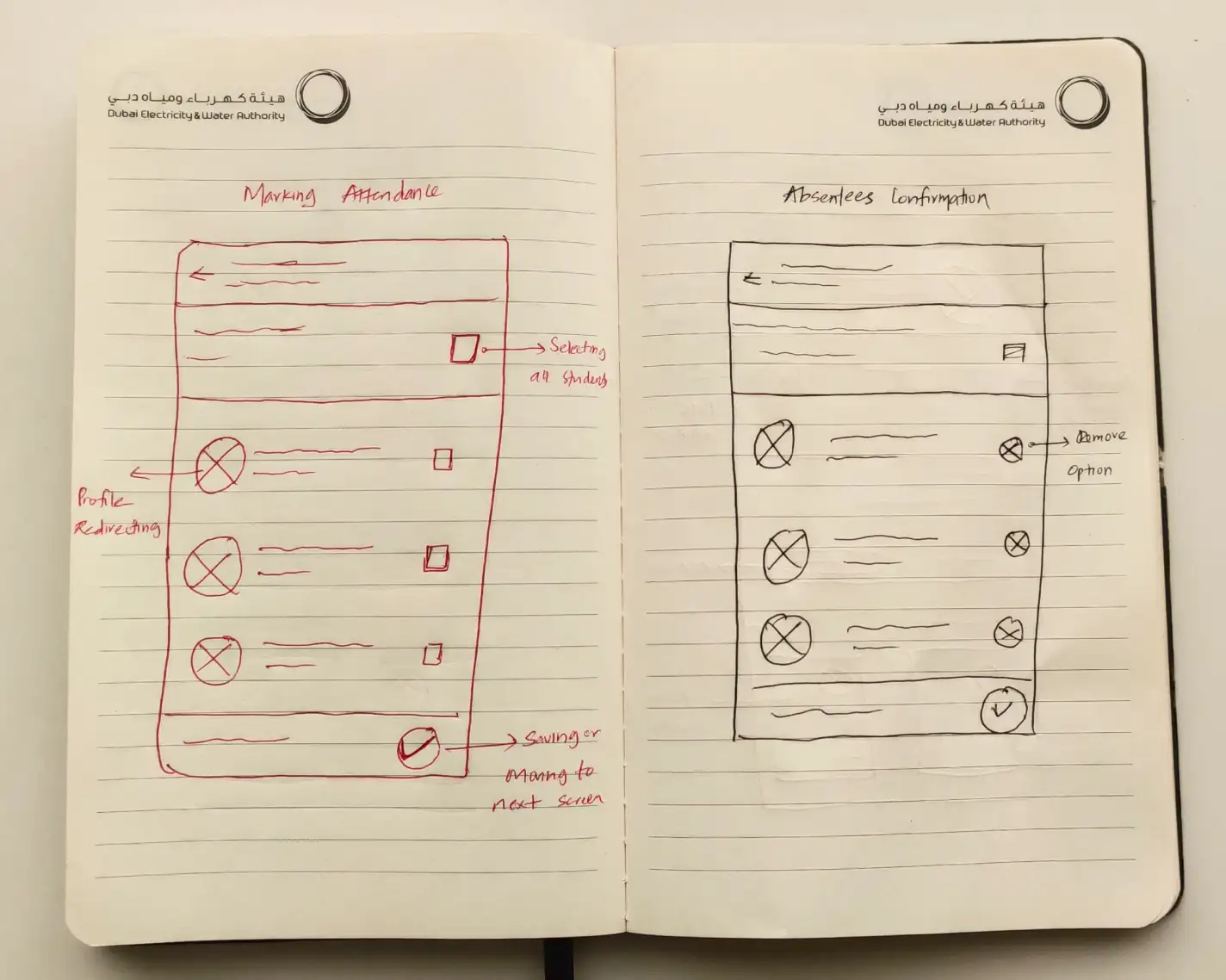
Sketches
I started by using a sharpie and a sketchbook to bring my ideas to life visually. Here are some sketches of the homepage and attendance screen after a lot of iterations.
Final designs
Following sketching and wireframing, I designed numerous visual design iterations. Below ones are the final outcomes, shaped through multiple reviews and user feedback.
1
Homepage
Users wanted a homepage with key app features right on the screen, no extra steps. After many tries, I made these changes.
2
Attendance
The primary purpose of the mobile app was to take daily attendance, and I aimed for the best possible user experience.
3
User profiles
Usually, teachers and students have profile sections where authorized individuals can view their information, contact details, experiences, and qualifications.
4
In-app messaging
To encourage user engagement in educational discussions and more, we've incorporated a user-friendly experience similar to WhatsApp on our platform.
5
Timetable & daily summary
These were the most requested features by clients, enabling them to view their class schedules and monitor student engagement around the clock.
6
Miscellaneous
Additional screens include Contacts, News Feed, and Campus Calendar, providing users with diverse functionalities beyond the core features.
Learnings
I see this as one of my significant contributions to Meshilogic. As the sole designer, managing the entire process, including research, interviews, and design, was challenging, yet engaging. I put in my utmost effort to deliver a high-quality product.

If you notice any apparent mistakes or believe there are better alternatives to the solutions I proposed, please don't hesitate to reach out. I would greatly appreciate any feedback provided.